Museum 2D
A new brand, icon, and emblem of its values is always a significant step for a company – a bet on the future and an opportunity to rethink the past and present.
A new brand, icon, and emblem of its values is always a significant step for a company – a bet on the future and an opportunity to rethink the past and present.
A new brand, in fact, marks in 1968 the transition of Molteni&C, founded in 1934, from traditional furniture production in classic styles to what we now define as design. At that year's Salone del Mobile, Molteni&C presents the emblem of its evolutionary choices: a brand designed by Hans von Klier and Luca Meda, capable of introducing traditional seal-like suggestions, tempered by a rigor rooted in the Ulm School. This mark evokes the history of the company’s image, with a recognizable graphic element, playing on the letter "M."
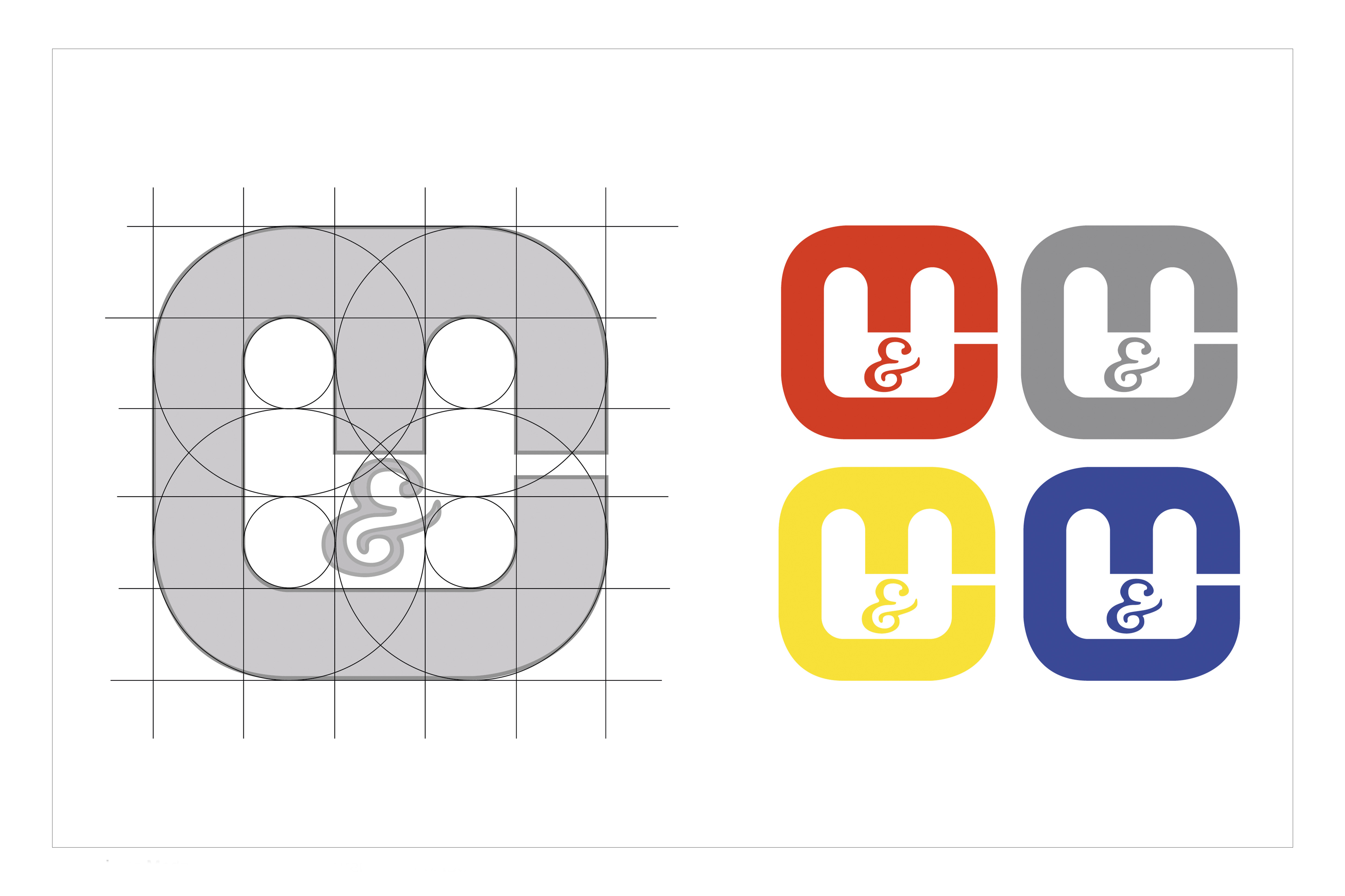
Molteni&C logo designed by Hans von Klier and Luca Meda in 1968
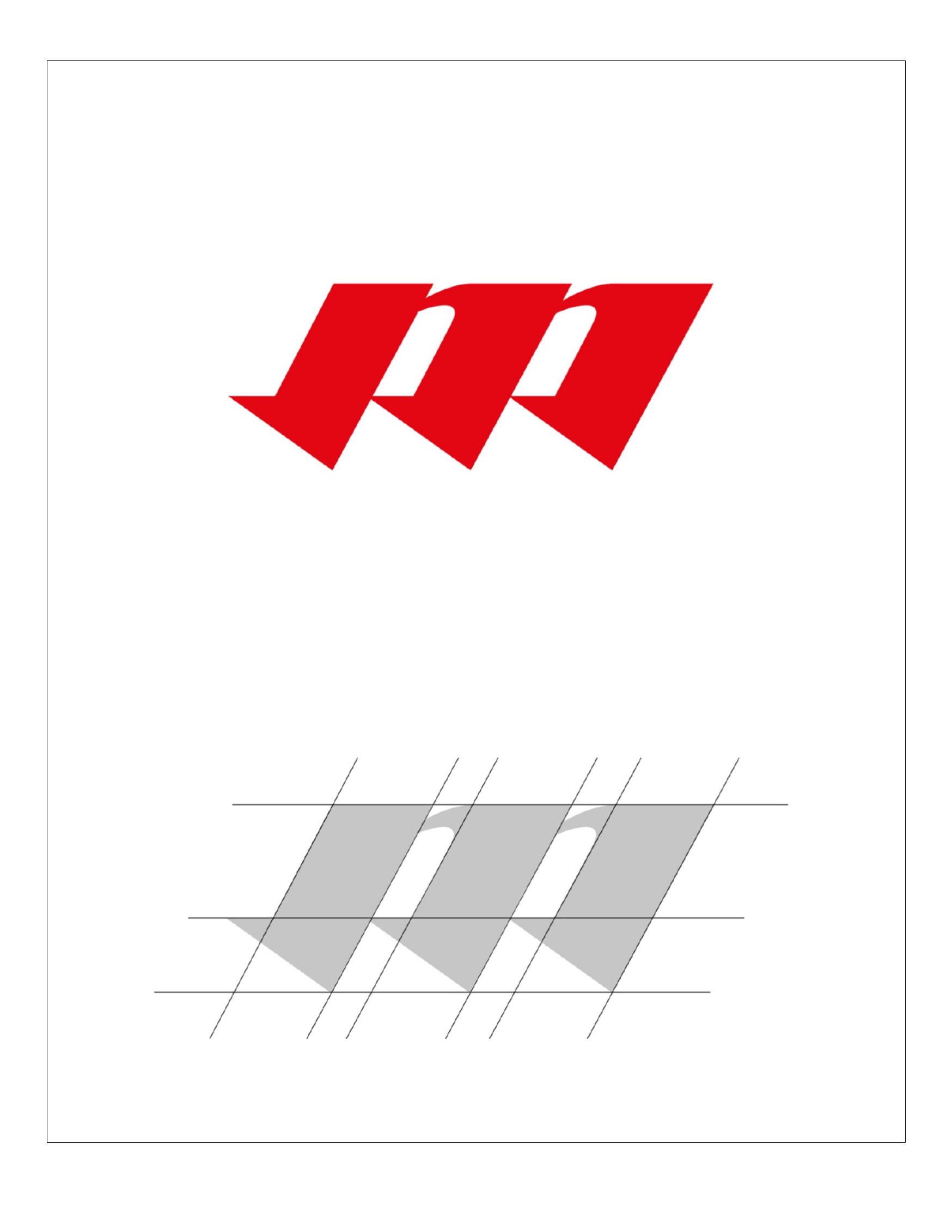
The brand of Industria Mobili Molteni Angelo, which appeared on letterheads in the 1950s, consists of two mirrored and staggered right triangles, subtly suggesting an “M”. Inside these shapes, an “A” for Angelo Molteni and a wooden texture are featured, evoking the craftsmanship for which the company has always been known. In the early 1960s, collaborations with designers intensify, and Industria Mobili Molteni Angelo transforms into Molteni&C. The new uppercase logo, ending with a period, is accompanied by a more geometric and minimalist graphic mark compared to the previous one: a red “M”, now explicit and tilted almost to create a perspectival effect.
Molteni&C logo, early 1960s.
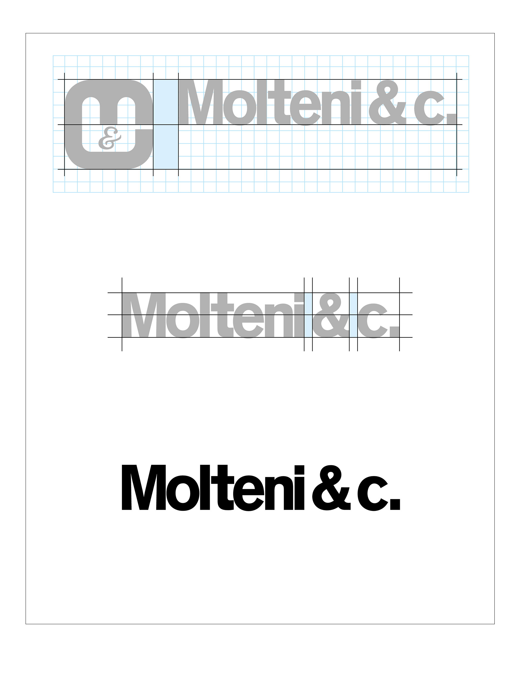
In these same years, Unimark International helped to design the graphics and staging of different Molteni&C stands. To complete or replace the trademark, in these stands was used the logotype "Molteni & c.", made with a minimal, clear and rigorous font. This logotype would gradually replace the previous logo in the 1980s.
Molteni&C logo, from 1970s to 1980s
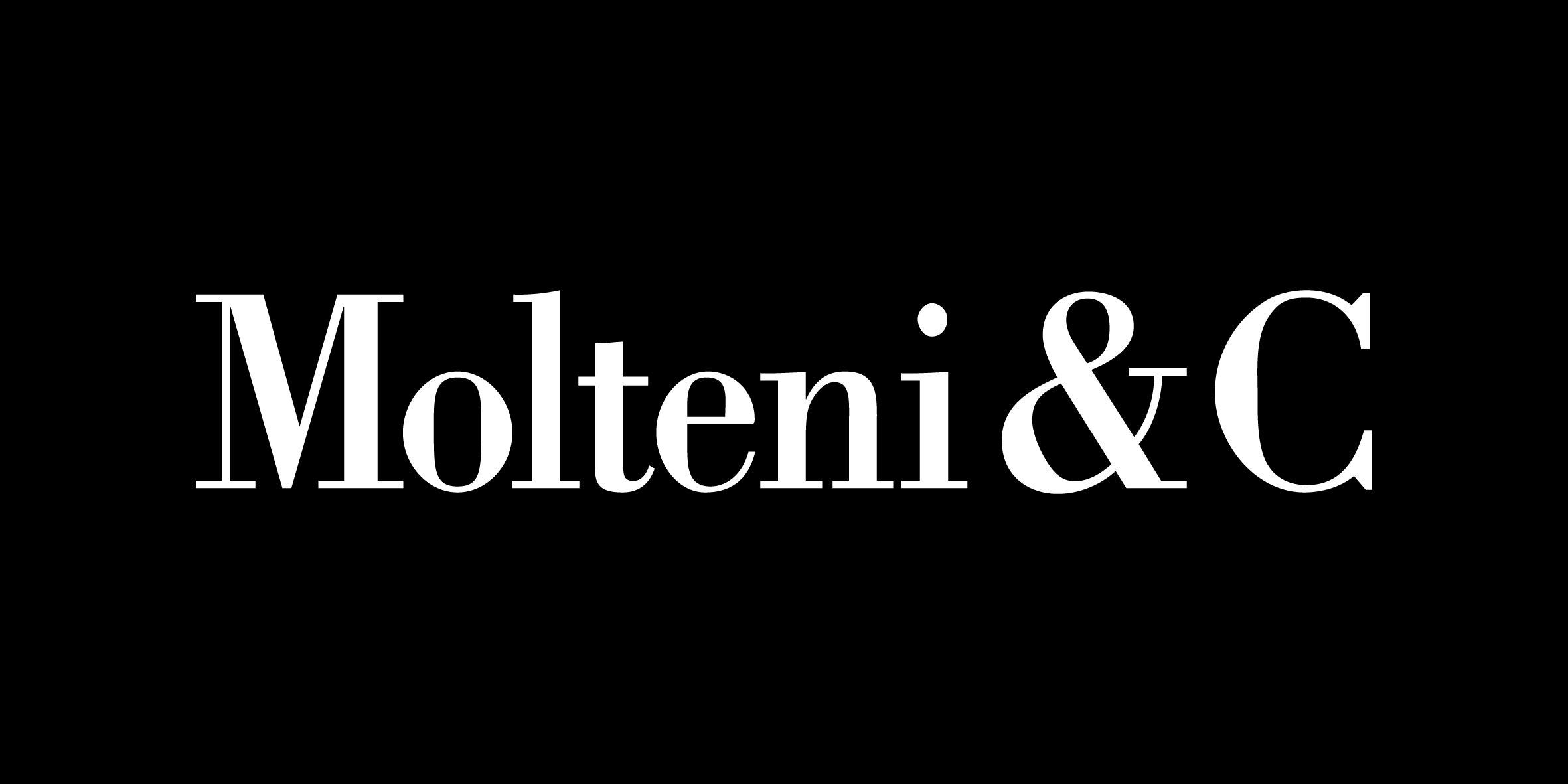
Between the end of the 1980s and the beginning of the 90s, Felix Humm (who was to manage the company’s image for 15 years) redesigned the Molteni&C logotype, opting for a more graceful typeface: Bodoni Berthold. The redesign was gradual. Initially, the more graceful font was introduced, going back to the capital C of the early 1960s and keeping the full stop.
Felix Humm, Logo Molteni&C
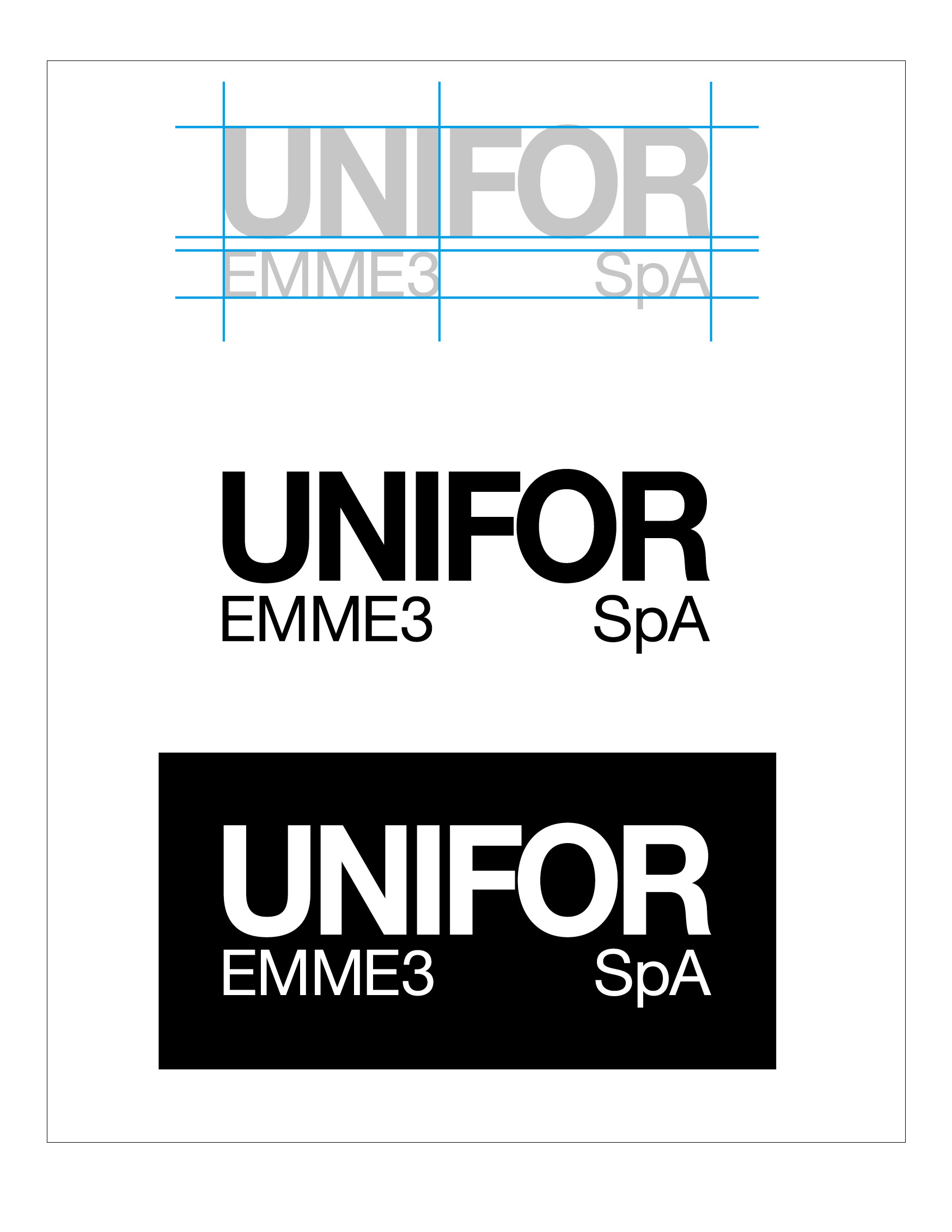
The end of the 1960s saw UniFor join the Molteni Group. Established in 1969, UniFor’s first logo was “UNIFOR EMME3”, adapting both the name and graphics of the Unimark International design firm: a homage to Unimark’s Bob Noorda and Franco Mirenzi who had developed the company’s first product: Modulo 3. The logotype was rigorous, precise and possessed clear references to the Bauhaus teachings that had been re-proposed by the IvKNO school and the Ulm School of Design.
Unimark International, Logo UNIFOR EMME 3, ‘70
Logo UNIFOR EMME 3, ‘70
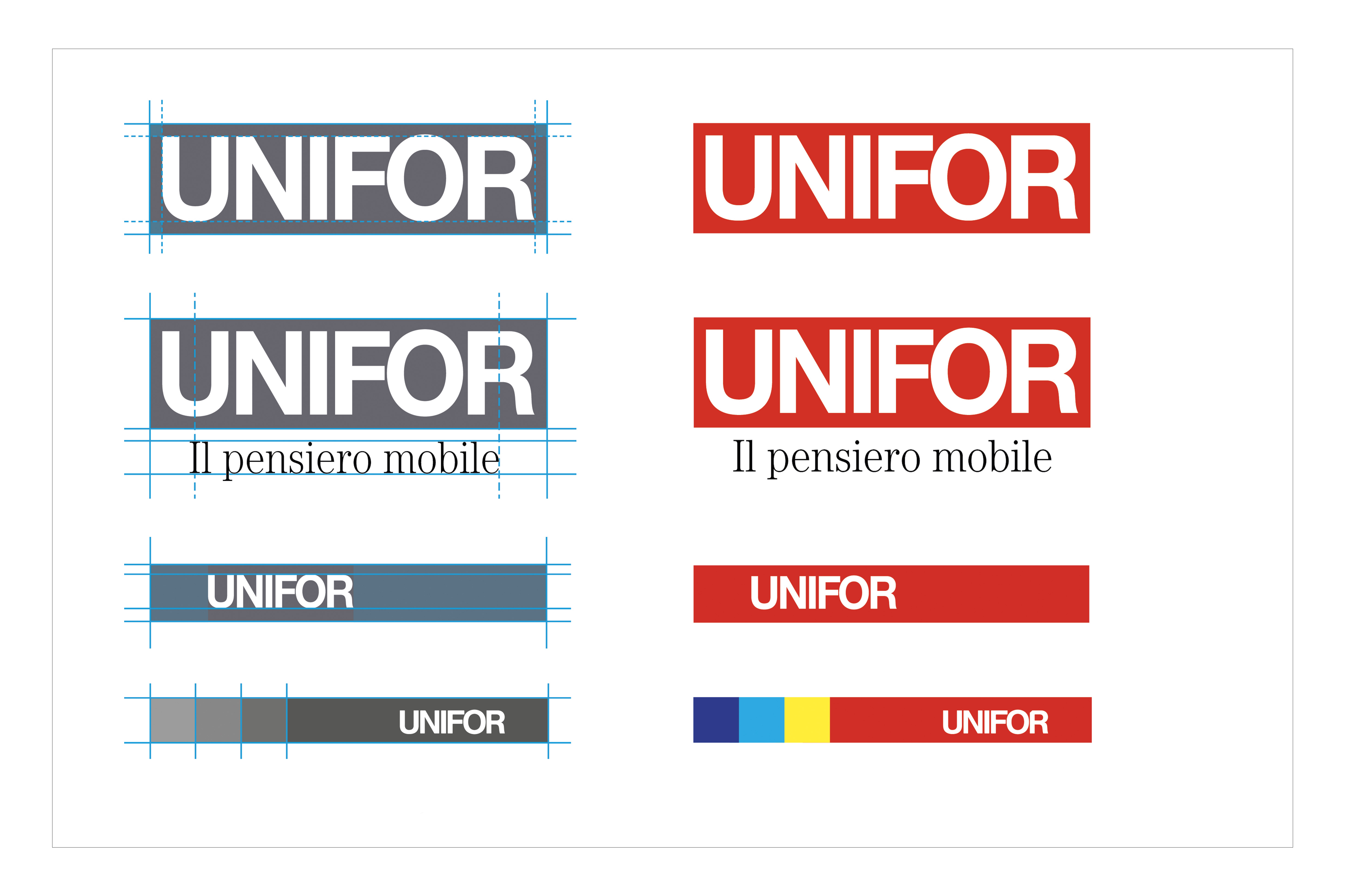
The 1980s mark a turning point for UniFor's corporate identity. With the arrival of Pierluigi Cerri as art director, the company introduces a clear and radical change in its communication strategy, while still maintaining its natural inclination towards understatement. In the early catalogs, the sans-serif typeface is paired with serif fonts used for the product names, creating strong visual contrasts. The historic “UNIFOR EMME3” is now abandoned in favor of the more direct “UNIFOR.” Cerri designs a small logo, in negative on a red background, positioned within a large white field, capturing the viewer's attention more effectively than a large-font inscription.
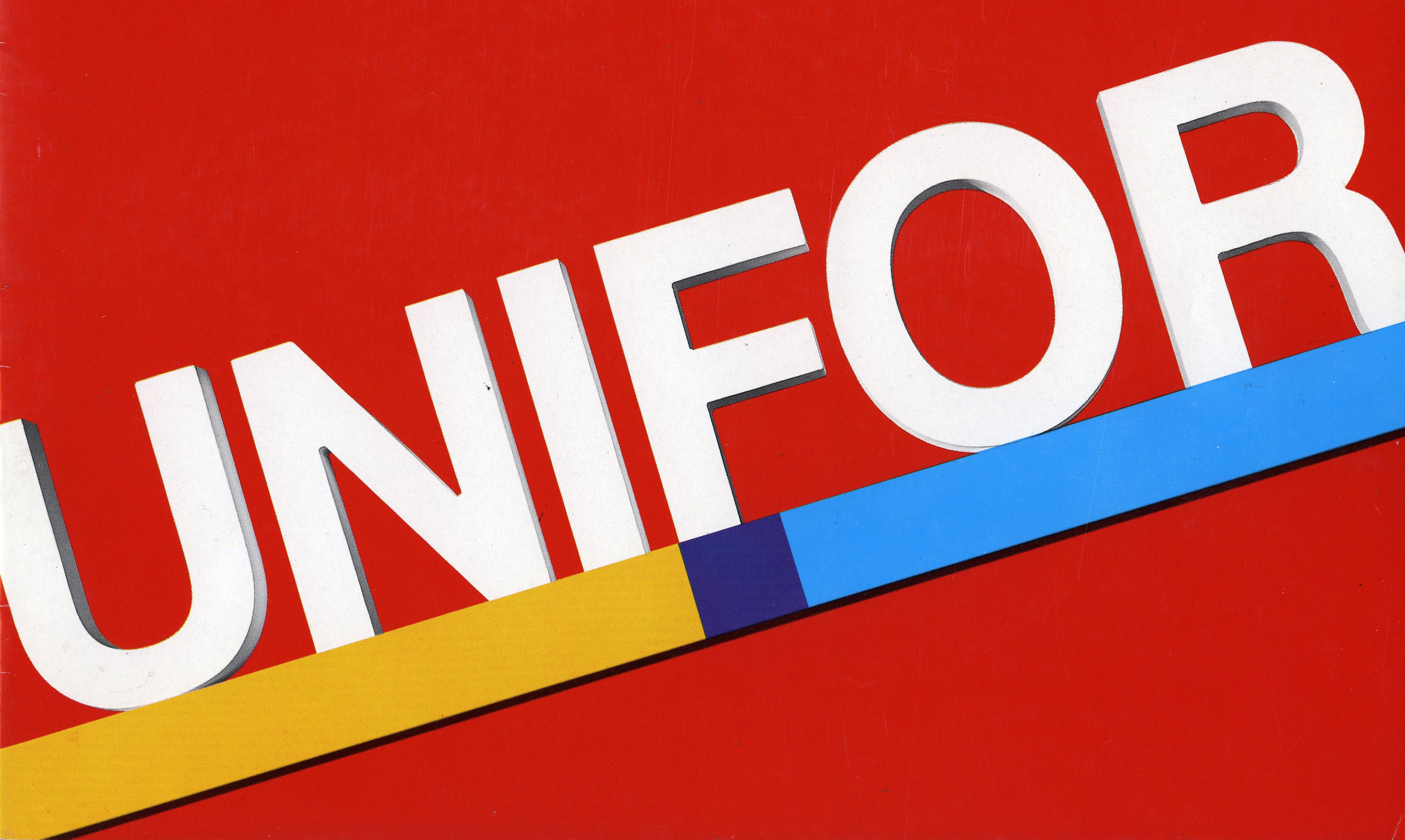
At the same time, Cerri introduced a selection of colours that were added to the red to accompany the UniFor logotype. Yellow and the blue, in addition to the original red, referred to the primary colours and to the essential nature of things, pointing to the idea that simplicity helps symbols stand the test of time.
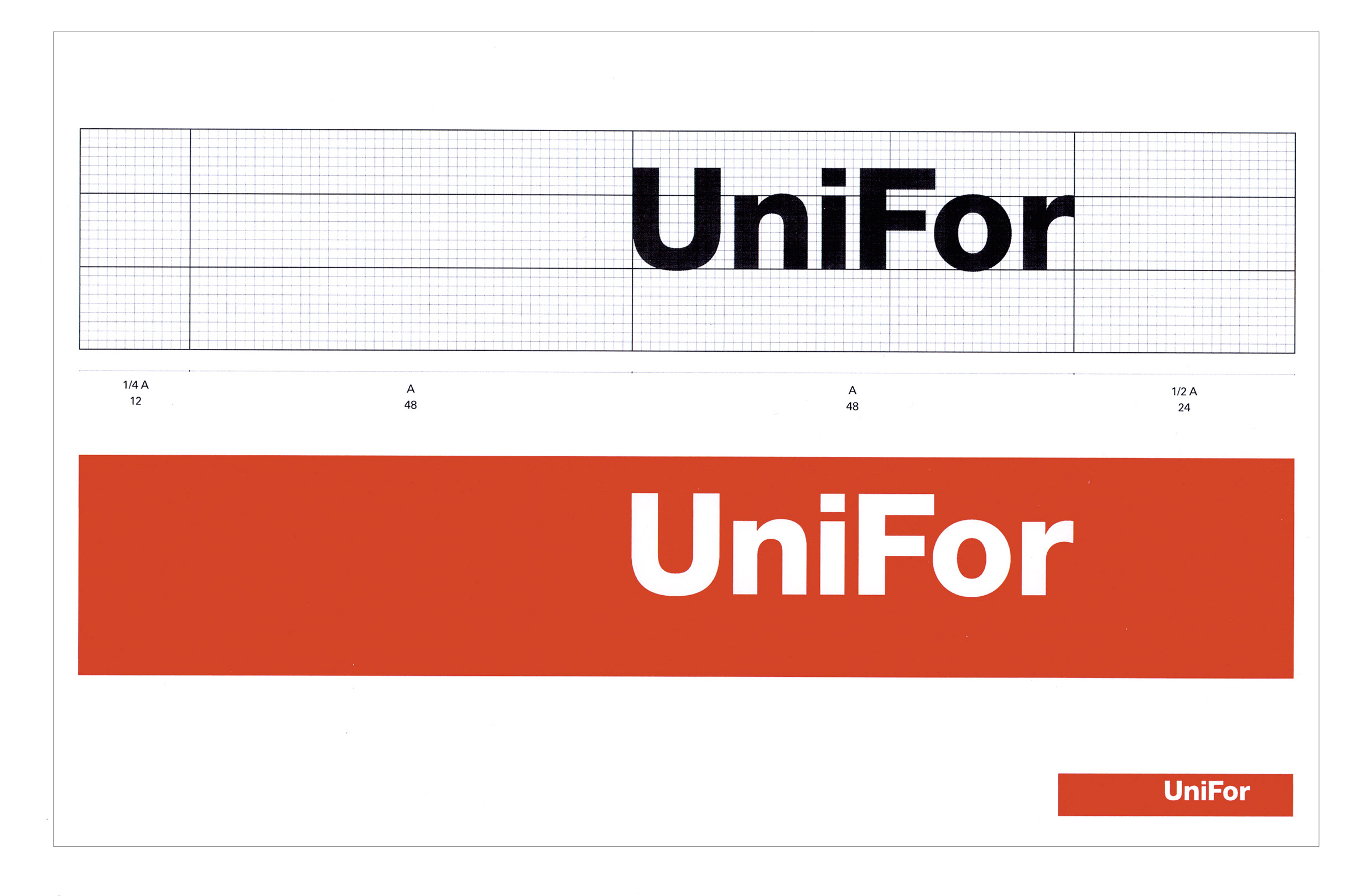
In 2014 Cerri changed UniFor’s logo, refreshing its message and adapting it to the company’s ethos, which evoked a specific cultural context: the U and the F remained in capital letters, differentiating themselves from the rest of the writing in small letters. What’s more, new importance was given to the red background with which the logo had been created.
Studio Cerri & Associati, logo UniFor, 2014
In 2021, Nicola-Matteo Munari worked on the redesign of UniFor's visual identity with the aim of enhancing the brand's reputation and its significant history. Munari implemented a carefully measured design intervention, without introducing radical changes in form.
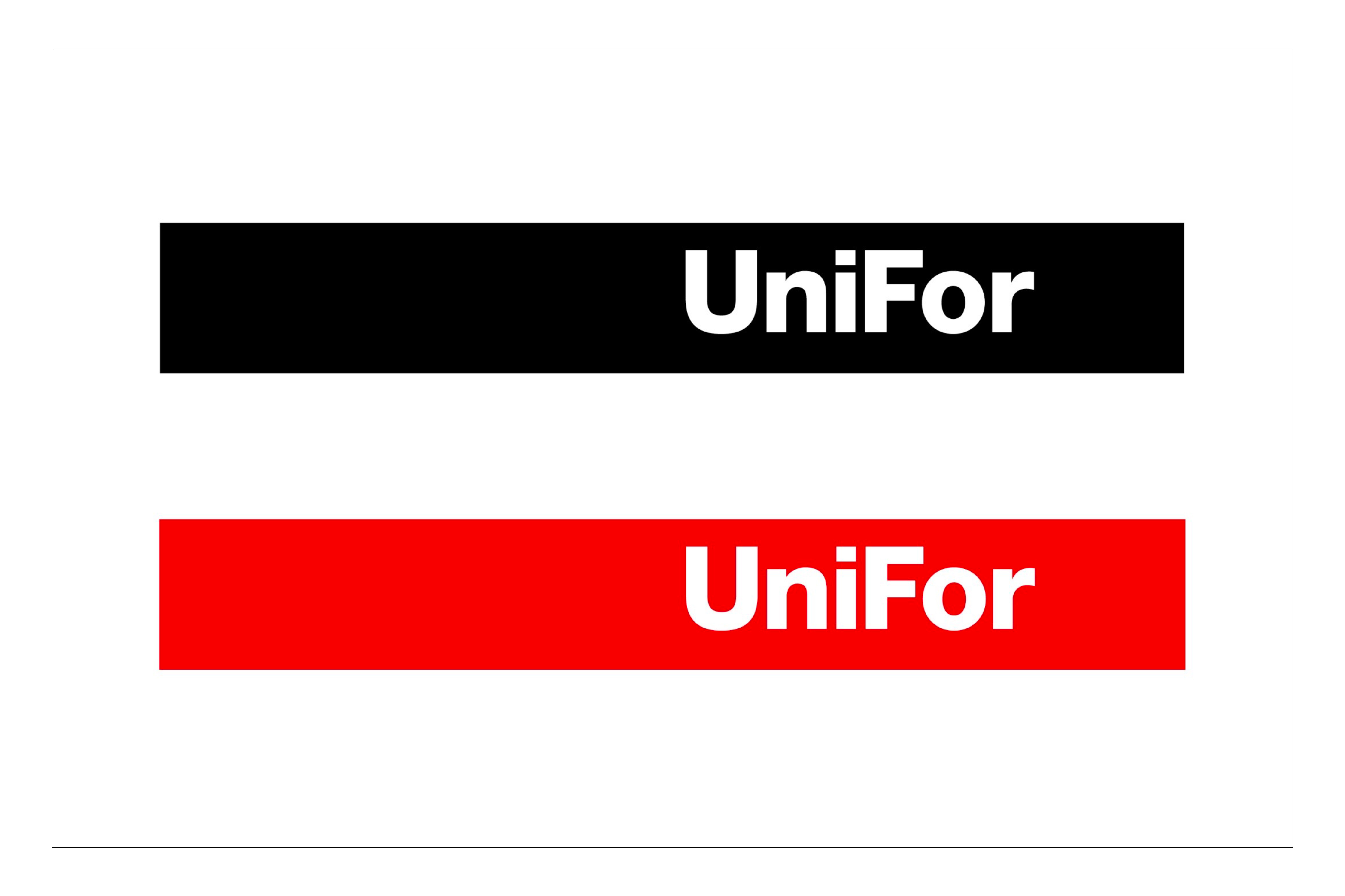
The red band is elongated, establishing a proportion that conveys greater visual tension, elegance, and impact, symbolizing an evolution in continuity with the brand's history.
Nicola-Matteo Munari, logo UniFor, 2021
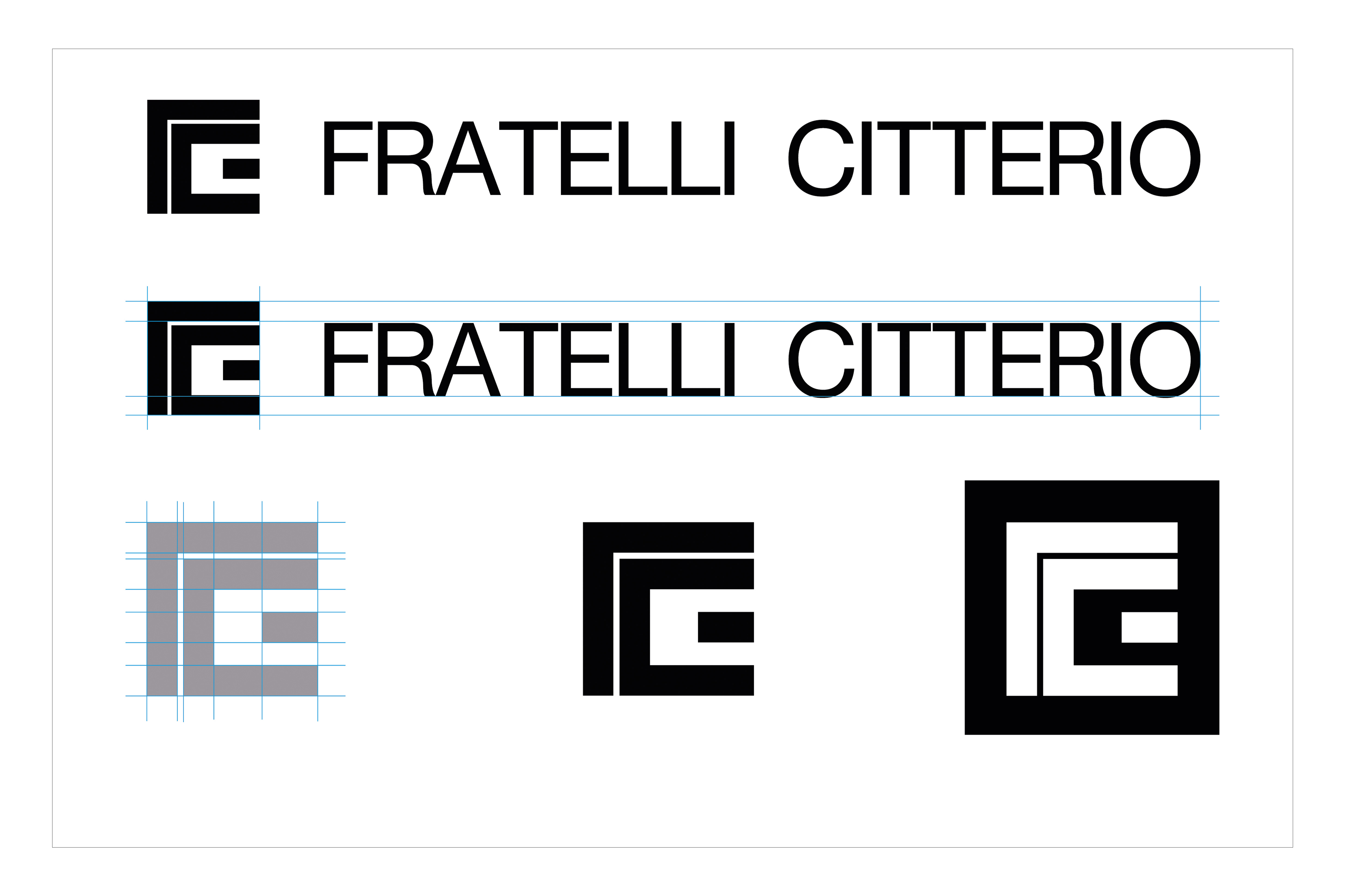
Unimark International also designed the logo for Citterio, which became part of the Molteni Group at the end of the 1960s. Founded in 1958 as Industria del mobile FRATELLI CITTERIO, the company shifted its production to office furniture in the 1970s with the design of the iconic Programma 3. The logo, redesigned by Unimark International, summarizes the family history of Citterio in the design of a mark made up of juxtaposed "F" and "C" letters, forming a clean, geometric, rigorous, minimalist, and immediate sign.
Logo FRATELLI CITTERIO, 1960s
This is accompanied by a simple and effective logotype, using the Helvetica font—a typographic choice capable of withstanding the passage of time, even though it has been adapted over the years through the use of color.
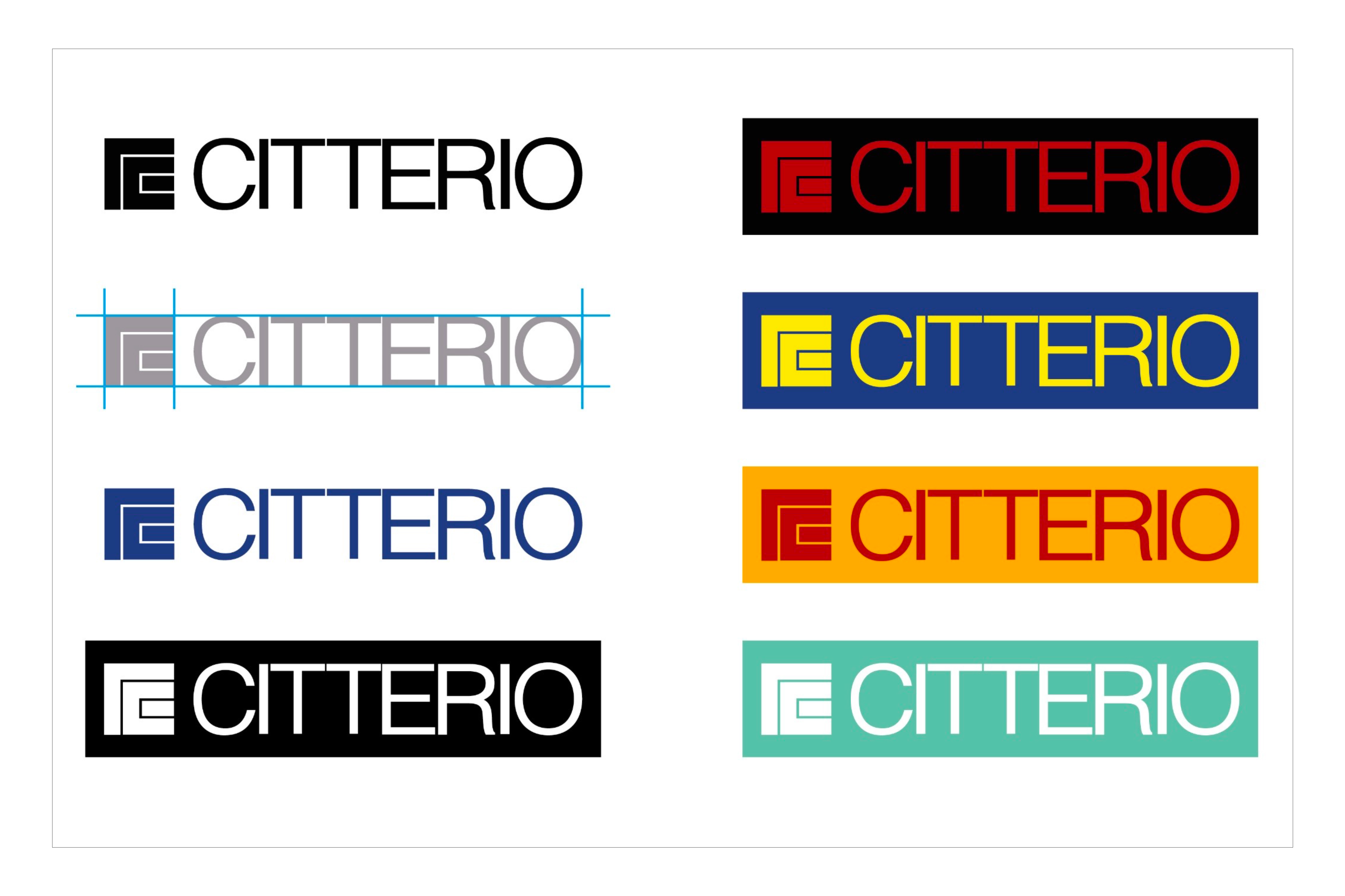
Unimark International, logo Citterio, 70s and 80s
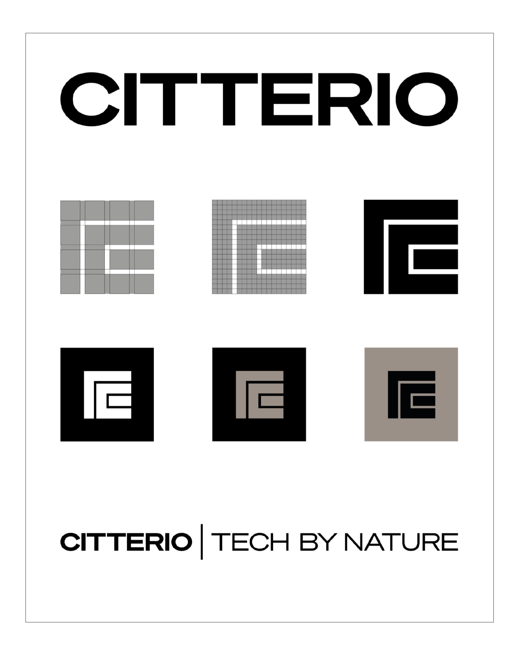
Under the artistic direction of Studio Klass, in 2022 Nicola-Matteo Munari redesigned the logo, creating a new balance between history and the present, aimed at conveying a vision of clarity, simplicity, and elegance.
Nicola-Matteo Munari, marchio e logotipo Citterio, 2022
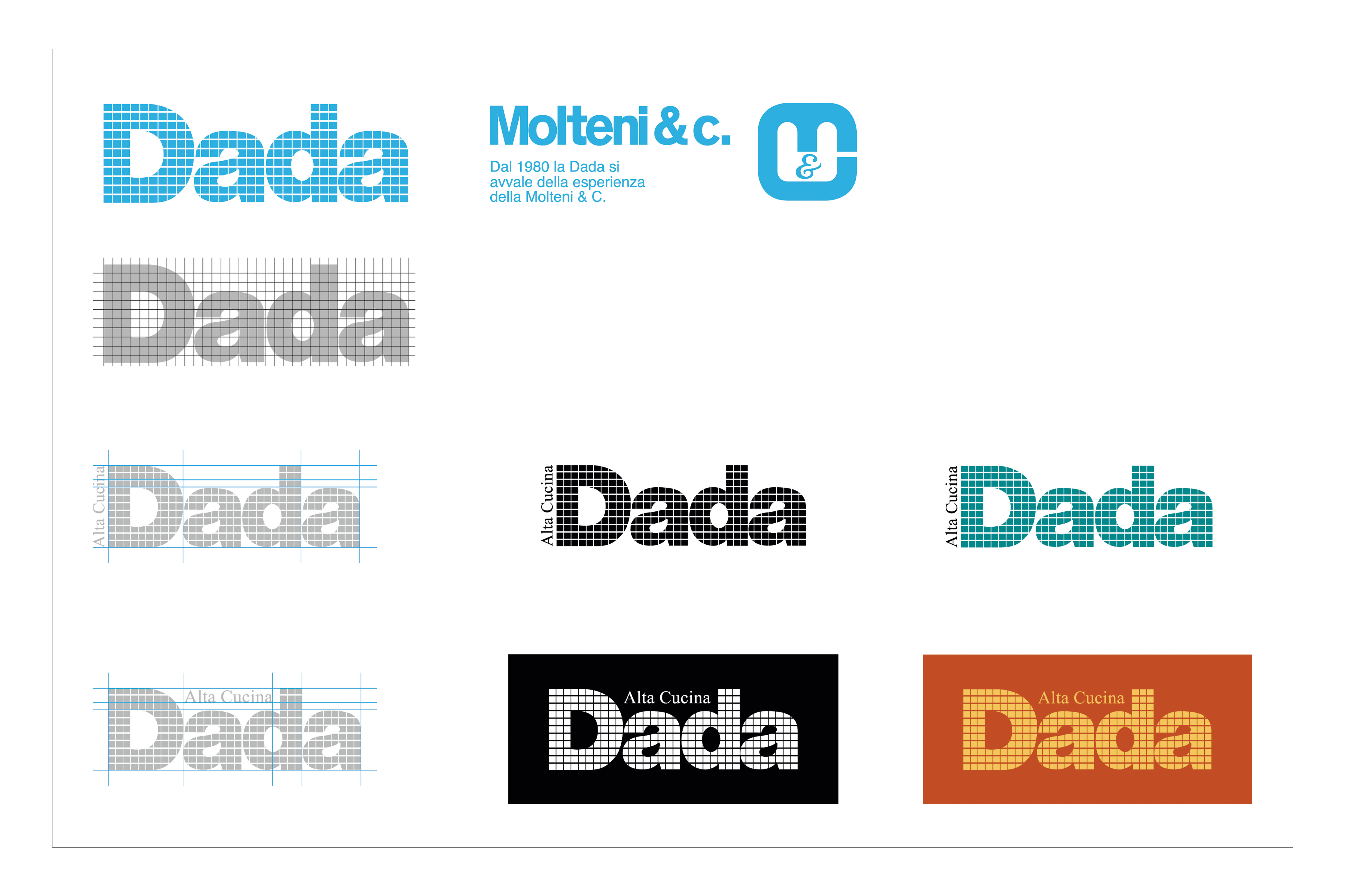
Dada Alta Cucina logo, from 1970s to 1990s
In 1979, DADA became part of the Molteni Group. The company, founded in 1926 and operating since 1950 as “Angelo Garavaglia e figli,” created the DADA brand in 1972, initiated by Gaetano Garavaglia. The graphic change corresponds to a shift in the company’s direction, which during those years began collaborating with world-renowned architects and designers. Alongside the DADA logotype, the phrase "Alta Cucina" appears. A rectangular mesh grid, where the squares have rounded corners, is the distinguishing element of the logo. This design remained unchanged even after the company joined the Molteni Group, until the early 2000s, when the typographic style was retained but in solid color. The phrase “Alta Cucina” was removed, although it would return to the logo during the period between the late 1980s and early 1990s.
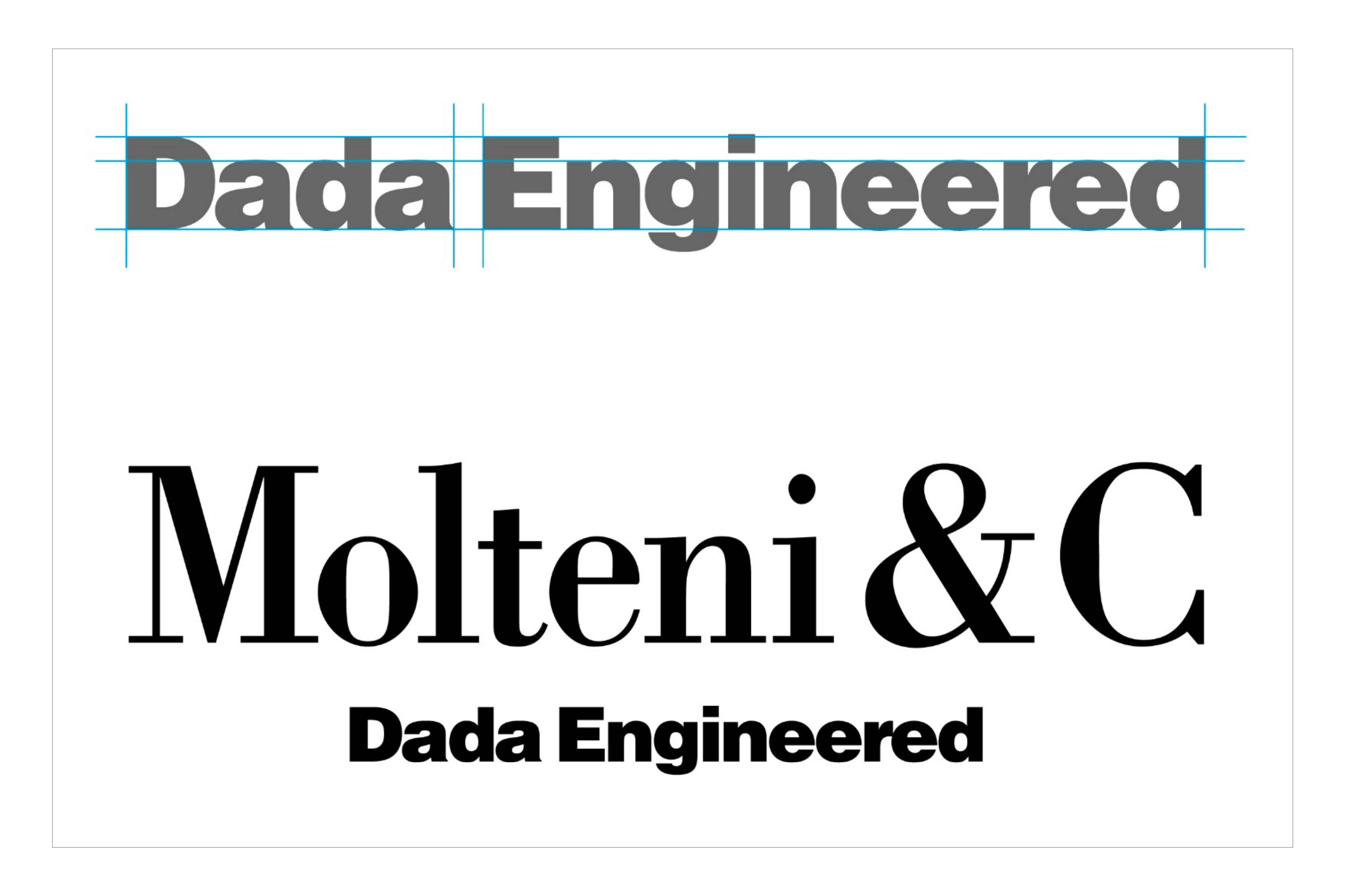
In 2023, Molteni Kitchen Dada Engineered was born, holding within it much more than just a word; it is a seal of innovation, a new tool to tell and certify the attention and care that has always been put into the design of kitchens. With the global expansion of the Group and the consolidation of the Molteni&C brand as a leader in home furnishing, the integration of kitchens under the Molteni&C brand becomes a strategic move.
In 2022, the Molteni Group logo was created by Nicola-Matteo Munari: a distinctive sign capable of carrying the group's values and identity independently of the recognizability of the component companies. The genesis of the brand comes from a laborious research process, able to look at the group's history with fresh eyes and involving the creation of over a thousand design sketches. The chosen symbol is the result of a simple intuition and at the same time a strong cultural and familial reference. The logo was designed starting from the drawing of a capital letter "M" with significant visual impact, the same "M" that, in a different form, characterized the early Molteni&C logos and appeared, spelled out, in the first "UNIFOR EMME3" logo. The letter was then cut in half and stripped of its upper part, resulting in a figure composed of three geometric shapes: a square, a triangle, and a square.
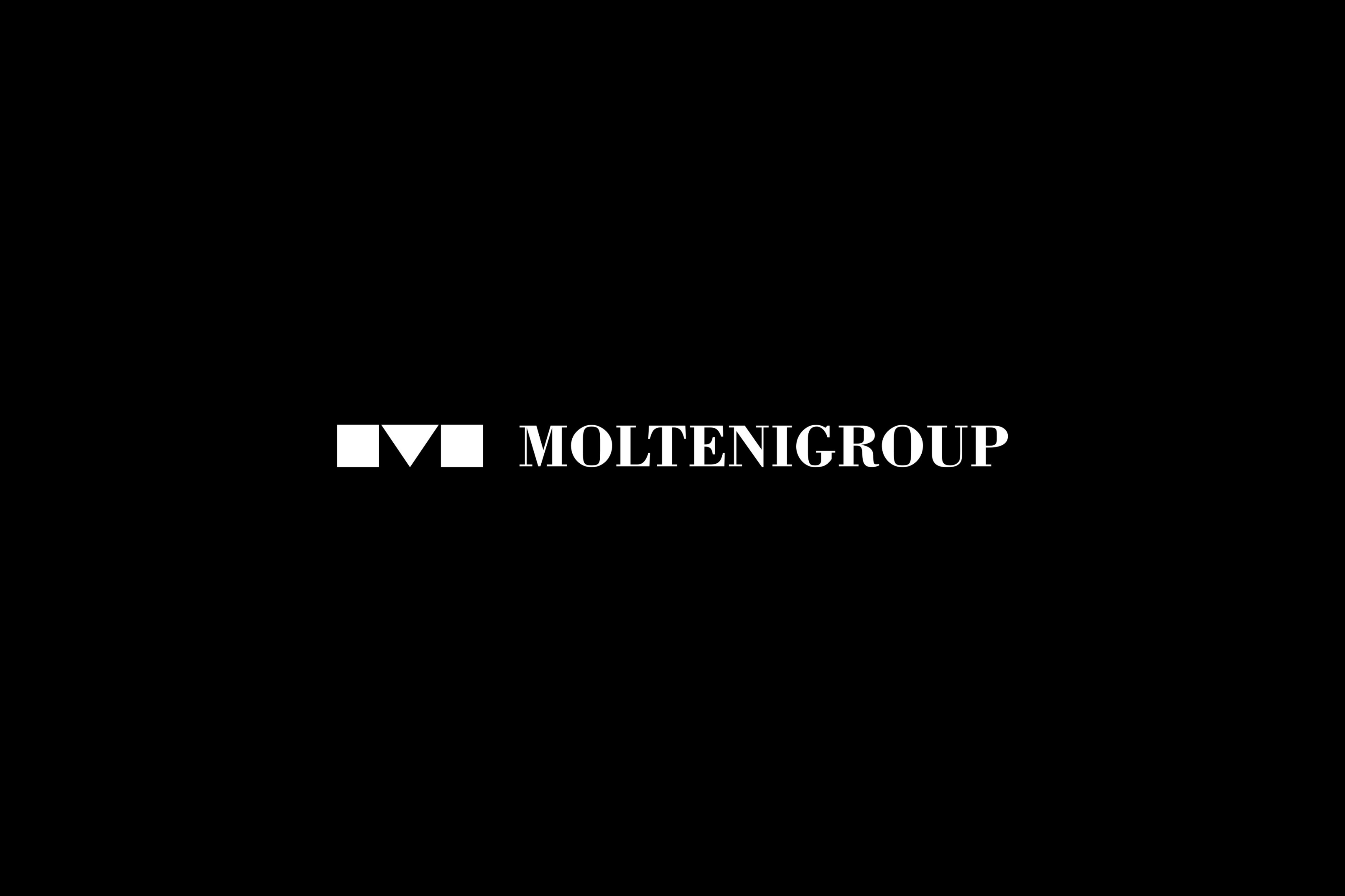
This is accompanied by a neoclassical-inspired logotype, carefully defined in its proportions, where the words "Molteni Group" merge, further reinforcing the message of unity. With the design rigor that characterizes it, the logo stands as a powerful symbol guaranteeing the quality and authenticity of the group’s core values.